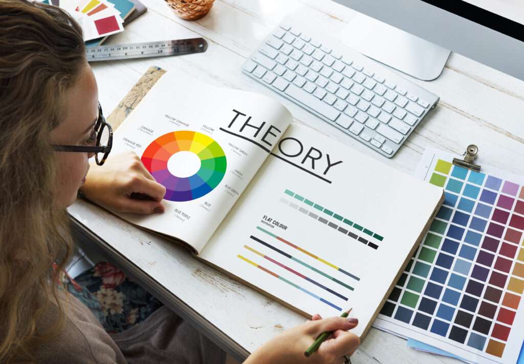
In the vibrant world of branding, colors are more than just a visual treat. They are powerful tools that can evoke emotions, shape perceptions, and influence consumer behavior. Understanding color psychology in branding is essential for crafting a compelling brand identity that resonates with your target audience. Let’s delve into how colors can become your brand’s silent but powerful ambassadors.
The Basics of Color Psychology in Branding
Why Colors Matter in Branding
Colors are not just aesthetic choices; they are critical in establishing a brand’s personality and tone. For instance, consider the calm and trustworthiness associated with blue or the excitement and energy conveyed by red. These associations can help brands communicate their values and connect with consumers on a deeper level.
The Psychological Impact of Specific Colors

Red: Energy and Passion
Red is a powerful color often associated with excitement, passion, and urgency. It’s commonly used in branding to grab attention and stimulate action. Brands like Coca-Cola and Netflix use red to convey energy and boldness, making their products stand out.
Blue: Trust and Dependability
Blue evokes feelings of trust, dependability, and calmness. It is widely used in the corporate world, with companies like IBM and Facebook leveraging its soothing qualities to build trust with their audience. Blue is ideal for brands looking to establish a reliable and secure image.
Green: Growth and Health
Green is synonymous with nature, growth, and health. It’s a popular choice for brands in the wellness and environmental sectors, such as Whole Foods and Starbucks. Green can symbolize freshness and sustainability, making it perfect for promoting eco-friendly products.
Yellow: Optimism and Warmth
Yellow exudes happiness and optimism. It’s an attention-grabbing color that can evoke feelings of cheerfulness and friendliness. Brands like McDonald’s and IKEA use yellow to create a welcoming and positive brand image.
Black: Sophistication and Elegance
Black is often associated with luxury, sophistication, and elegance. High-end brands like Chanel and Louis Vuitton use black to convey exclusivity and timelessness. It’s a versatile color that can also suggest mystery and sophistication.
Purple: Creativity and Royalty
Purple has always been connected to creativity, elegance, and royalty. It’s a popular choice for brands aiming to project a sense of high quality and creativity, such as Cadbury and Hallmark. Purple can also convey a sense of mystique and innovation.
Combining Colors for a Strong Brand Identity

While individual colors carry specific psychological meanings, the combination of colors can enhance a brand’s messaging. A well-thought-out color palette can communicate multiple aspects of a brand’s personality and appeal to a broader audience. For example, combining blue and green can emphasize trustworthiness and environmental consciousness, making it ideal for eco-friendly financial services.
The Role of Cultural Context in Color Psychology
It’s important to note that the perception of colors can vary across different cultures. For example, while white is often connected to purity in Western cultures, in many Eastern cultures, it may represent sadness. Brands aiming for a global presence must consider these cultural differences to ensure their color choices resonate positively with diverse audiences.
Implementing Color Psychology in Branding Strategy
Choosing the Right Colors for Your Brand
Selecting the right colors for your brand involves more than just personal preference. It requires a deep understanding of your brand’s values, target audience, and the psychological impact of colors. Conducting market research and testing can provide valuable insights into which colors resonate most with your audience.
Color Consistency Across Brand Elements
Consistency in color use across all brand elements is crucial for building a recognizable brand. From logos and packaging to marketing materials and digital platforms, maintaining a consistent color scheme helps reinforce brand identity and improve brand recall.
The Role of Color in Logo Design
The logo is often the first point of contact between a brand and its audience. Therefore, the choice of colors in a logo is critical. A well-designed logo with appropriate color choices can effectively convey the brand’s message and create a lasting impression.
Color Psychology in Digital Branding
In the digital age, color psychology extends beyond physical products to digital interfaces. The colors used on a brand’s website, social media, and apps can significantly influence user experience and engagement. For example, a calming blue might encourage users to spend more time on a website, while a vibrant red might drive immediate action.
Common Pitfalls in Color Selection

While color psychology offers a powerful tool for branding, missteps in color selection can lead to unintended perceptions. For instance, using too many colors can create confusion, while the wrong color combination can clash and turn potential customers away. Brands must carefully consider their choices and seek professional advice if needed.
FAQs
How does color psychology affect consumer behavior?
Colors can evoke emotions and associations that influence consumer perceptions and decisions. For example, red can stimulate appetite and urgency, making it effective for food and sales promotions.
Can a brand change its colors over time?
Yes, brands can rebrand and change their color schemes. However, this should be done thoughtfully to ensure the new colors align with the brand’s values and target audience.
Are there any universal rules in color psychology?
While some general trends exist, such as blue being associated with trust, color perception can vary widely across different cultures and individual preferences. Brands should consider these factors when choosing colors.
How can I test which colors work best for my brand?
Brands can use focus groups, surveys, and A/B testing to gather feedback on different color schemes. This helps determine which colors resonate best with the target audience.
What role do secondary colors play in branding?
Secondary colors complement the primary brand colors and can add depth and variety to the brand’s visual identity. They are often used for accentuating and highlighting specific brand elements.
How important is it to consider color blindness in branding?
It’s crucial to ensure that brand materials are accessible to everyone, including those with color blindness. Using high-contrast colors and textures can help make designs more accessible.
Conclusion
Color psychology in branding is a fascinating field that can significantly impact a brand’s success. By understanding the emotional and psychological effects of colors, brands can craft compelling identities that resonate with their audiences. Whether you’re a startup or an established brand, thoughtful color choices can enhance your branding strategy and create a memorable experience for your customers. As you explore the world of color psychology, remember that the right color can be the key to unlocking your brand’s full potential.


